In this task I will be analysing 8 different film posters and I will be answering the 3 questions listed below:
1. What do you think the film is about and what might the storyline be?
2. What genre(s) do you think the film belongs to?
3. Who do you think is the target audience?
Blade Runner (1982)
1) I think that Blade Runner is about a alien invasion mainly because of the spaceships on the front of the poster. The fact that the movie in 1982 suggests that this may have been a completely different movie to what was already out due to it being about spaceships/the future etc.
2) I think the genre is a hybrid of action and Sci-Fi. I can acknowledge this from the facial expression on the male in the top left corners face which are aggressive and repulsive as well as the gun in his hand which suggests he is looking to create war with something or someone.
3) I think the movie is aimed towards 14-22 year olds. This is because it contains action which would really appeal to younger adults.
Scary Movie 2 (2002)
1) I think that Scary Movie 2 is a parody movie about scary movies in this day and age. This is mainly because of the slogan on the girl on the rights top which says ' I love dead people'. This is from the movie 'The Sixth Sense' and has been altered from 'I See Dead People. Also the facial expressions of the actors on the poster suggest they are shocked and have experienced something that is really weird to them.
 2) I think the genre of Scary Movie 2 is a hybrid between a comedy and a parody. This is because of the fact that the movie title is 'Scary Movie'. A scary movie wouldn't be called 'Scary Movie' suggesting the director called it that as a joke in order for it to suggest the movie is not really a scary movie.
3) I think this movie is aimed at 15-22 year olds .This is because of the characters being young adults so this movie can be relatable to their own lives. Also the colours on the poster are quite young, flashy and bright colours
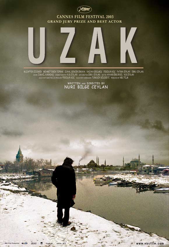
Uzak (2002)
1) I think this movie is about something that has happened to the man on the cover which has resulted in him drifting away from everyone and becoming isolated. This may have been from the loss of a loved one or the failure in something. From this I think the storyline is about him trying to regain something he lost or trying to patch that up by doing something else.
 2) I think this genre of this movie is a hybrid between Drama and Thriller. This is mainly because of the the fact that the man being so close to the cliff suggesting throughout the movie he is close to death but is trying to save himself
3) I think the target audience are ranged from 20-30 year old. This is mainly due to the fact that the movie poster is dull and dark and not colourful (which would appeal to a younger audience)
I'm Not Scared (2003)
1) I think this movie is about a boy who digs a hole and finds something he weren't expecting and isn't scared of searching through. I came to this conclusion from the fact that 60-70% of the poster is black and dark. This connotes that most of the movie is spent under ground in the darkness.
2) I think the genre of this movie is a Drama or an Horror. I have come to this from the reason of it being dark and gloomy as a pose to bright and sunny connoting the theme of happiness.
3) In my opinion the movie is aimed at around about 14-22 year old's. This is because the movie looks like it is a horror from the title and the image.
Sin City (2005)
1)In my opinion, I think this movie is about a city of sinners. It may include drugs, guns, sex etc. I think this town has become miserable and run-down.
2) From the movie poster I have identified the guns in the 2 male's hands'. This suggests that this movie is in the genre of a action movie. Also the character at the front is standing quite broadly and powerfully signifying his authority.
3) I think this movie is targeted at adults ranging from about 18-30. This is because it may contain sex, guns and drugs which would already give it a 18+ certificate. Also it wouldn't appeal to anyone of a older age (30+) because of the darkness in the movie and the negativity.
Pirates of the Caribbean - Dead Man's Chest (2006):
1) I think Pirates of the Caribbean - Dead Man's Chest is about a group of Pirates who are probably looking for the 'dead man's chest'. The movie may be about their journey to their destination and the follow up of obstacles that approach them. Of the 3 characters on the front, Johnny Depp is the largest which may imply that he is the main character.
2) From the poster we can tell that the movie is a hybrid of an adventure/action. I have come to this from Johnny Depp (Character on the top left) holding a gun. Guns gives a immediate impression to the audience that the movie includes action.
3) I think this movie is aimed at kids to young adults.
1) I think this movie is about a girl and a boy from different societies falling in love. This is mainly because of the slogan suggesting that she's from bollywood and he's from hollywood and this causes prejudice between their families. Also the poster has 2 sides. Her side and his side. Her side includes the Taj Mahal which is located in India and is a religious place. His side includes sky scrapers and palm trees which connote hollywood.
2) I think the genre of this movie is a romance. This is because of the fact that it is about 1 girl and 1 boy coming together and also the slogan says that it iss a romantic movie.
3) I think the film is targetted at around about 17-25. This is mainly because these are the years most people settle down with someone and fall in love.
 Million Dollar Baby (2004):
1) This poster suggests that the movie is about sports/boxing. We can see this from the fact that the woman is wearing boxing attire and looks aggressive. Her body is facing away from the camera but her eyes are kept on guard to the left of her. This may suggest she is always looking out and intensifying her skills by the day.
The lighting used is low-key as it creates a lot of dramatic shadows over the 3 character's faces'.
2) The genre of the movie is likely to be a hybrid of sports and drama. This is because of there being 3 main characters. Instead of there being just a trainee and a trainer there is someone who could come in between them.
3) This movie is targeted at adults and maybe young adults. This is likely as it is a motivational movie and wouldn't appeal to kids. The colours on the poster are too dark to appeal to anyone under the age of 14.


 3. The use of a top light above him creates shadows under his eyes and under his chin connoting he also could be hiding something. This image is created with high- key lighting. I can see this from the low and high contrast of lighting which makes him seem medieval. The lighting used makes him appear powerful and superior and his body language further reinforces that.
 6. In this still image low-key lighting is used to contrast both the light and shadow which conveys how natural and realistic the image appears to be to the audience.
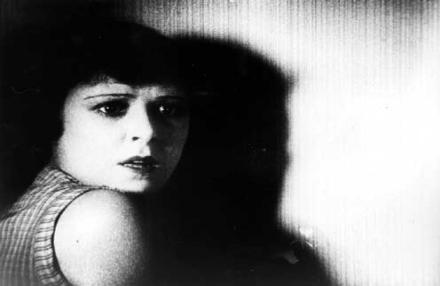 8. Low-key lighting is used to create a dark shadow of the girl on the wall. It is likely this still image is from a horror. She is facing the wall as her neck is facing just near the camera suggesting she is looking for something or someone. The key light allows us to catch her facial expressions. The chiaroscuro in this image is powerful.
 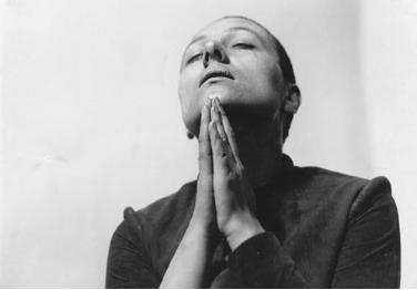 9. The use of High-key Lighting shows us the characters facial expressions and their body language. The lighting is very exposed.
 10. Low-key lighting is used in this image.
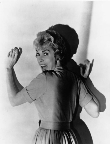
  11. High-key lighting is used to create a dramatic shadow behind the female which may suggest she is hiding something or someone from the man who is likely to be her partner.


